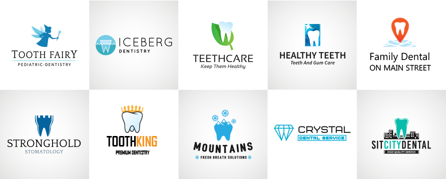
When it comes to smart dental practice marketing you can check all the boxes and feel like you’re doing everything right and still see lackluster results. That could be due to a lack of easily identifiable presence in your community. That’s why having a stand-out dental practice logo can be the difference between being memorable and being forgettable.
Let’s use our imaginations for a bit, shall well? I’ll set the scene.
A brand new doctor is nicely settled into her new office, she’s got a great staff around her, and the practice seems poised to take off on a successful run of serving patients. And then … crickets. A patient trickles in here and there, but things just seem off—almost like people aren’t aware of this awesome new dental practice.
Yet they’re sending out postcards regularly, social media posts are scheduled and go out every few days, and the practice has a website that’s top of the line. It feels like they’re doing everything right only to be disappointed. What could be going wrong?
The importance of a practice logo.
In a world where there sometimes seems to be a dental office on every corner, having a distinct identity that people can easily remember is key to differentiating from other offices. An effective (and essential) way to do this is with a unique practice logo that succinctly tells potential patients about your dental office.
To put it simply your logo will be a concise yet powerful visual representation of what you want patients to know about your dental office. It can convey information like practice type, core values, target demographic, street location, etc.
When you’re able to combine this information with interesting visuals you create a tangible image that people can relate back to your practice much more easily than words (like a name) alone. For example, compare these two situations:
- Practice 1 is a pediatric dental office that sends out a postcard without a logo. They identify their practice simply with the Doctor’s name. After a month they only receive four calls from potential patients—and only two are actually looking for a pediatric dentist.
- Practice 2 is also a pediatric office that sends out a postcard, which has their logo—a smiling floss dispenser with the words “Pediatric Dentistry”—on it. They receive eight calls and all but one are seeking a pediatric dentist.
Coincidence? Not likely. By having a clear visual representation of who their practice is designed to serve Practice 2 is much more likely to be remembered by people who saw their postcard and called when the need for pediatric dentistry arises. By having a specific and purposeful logo they’re setting themselves up to be remembered by potential patients and called upon when needed.
4 Tips to Ensure Your Logo Makes an Impact
- Reach out to a professional marketer with experience working with dental offices. They will be able to offer tips and perspectives you might not have thought of that help you attract your ideal patients. By combining your dental expertise and their knowledge of effective marketing you’ll get the best logo possible.
- Consider your target patient base and constantly turn to them as a guide when designing your logo. What words, phrases, colors, and fonts will they relate to most? (The marketing expert you’re working with will help you answer these questions.) Are you in a larger city with a young population? A small town with an emphasis on hard work? By recognizing your target demographic you can create a much more effective logo.
- Brainstorm potential practice names and discuss with your team. Once you know your general patient base start listing words and phrases that relate to that—this can mean including the type of practice (oral surgery, periodontology, general dentistry, etc.), some geographic reference such as a street name, a general oral health term, etc. This is the most important part! And if you decide to lead with the doctor’s name it can still be helpful to add a descriptor. Something like Dr. John Doe, DDS, Oral Surgery is better than just the name itself.
- Decide on a visual design aspect so that your logo is more than just words—an attractive image is more likely to be remembered. Work with the professional marketer to create a unique design that embodies the essence of your practice. The combination of fonts, colors, and other artistic elements is what elevates a logo from blah to bold. Only then will it become the face your dental brand and an image that gets noticed.
Without a distinct, attention-grabbing logo, you could be facing an uphill battle in getting your practice out there and connecting with potential patients. Don’t make it harder than it needs to be. Take the time to create a thoughtful and engaging logo that the whole dental team can be proud of—and celebrate each new patient that walks through your door.
Source:
http://www.dentistryiq.com/articles/2015/11/is-your-dental-practice-logo-boring.html

